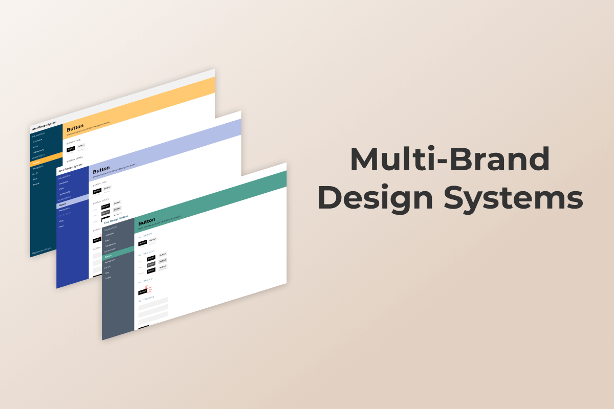
Ares, a Multi-Brand Design System
When I mention Launch That, most people think - oh, another ‘cool’ agency. What most people don’t know is Launch That owns the brands they create. They currently own 7 brands. So how do you create and maintain seven brands at once, consistently?
Defining a Clear Process
Before I started working as a Design System Lead, I worked as a developer & designer for 3 of the brands. The work process in the dev/design team unquestionably needed some improvement.
Designers used to create mockups without any guidelines. Every mockup was unique, and each designer would try to give a particular style to their creations.
This process wasn’t sustainable and brought two notable issues:
-
Design inconsistencies
-
Reinventing the wheel syndrome
We reached a point where some brand websites had more than thirty different shades of grey, and some icons would have more than five different variations. 🤯 Yikes!
These inconsistencies were a genuine concern, hurting the user experience. Still, it was hurting both designers and developers as they would spend a tremendous amount of time recreating the same components repeatedly.
When we began our design system, Launch That had 4 brands, Asbestos.com, Drugwatch.com, Annuity.org, and DrugRehab.com. It wouldn’t be surprising to see this number going up through the years. This is great for the business side, but as a small, scrappy team of designers and developers, how can we possibly keep up?
This work process or I should say lack of process, wasn’t acceptable anymore, and it was time to create a proper design system.
To help us get started, we recruited Brad Frost, a leader in standardization and design systems. Brad was asked to come to give a 2-day workshop to help our team better understand how we can implement design systems into our current plan for standardization.
The workshop was incredibly effective as it helped validate our efforts and plan for standardization, better understand the type of team structure we need to accomplish it.
Foundations is Key
Design Systems is a futuristic idea rooted in ancient tradition.
I learn this from reading A Pattern Language by architect and design theorist Christopher Alexander. The basis of the book came from observing medieval cities. All were designed to local regulations but allowed the architect to adapt each room, level, and building to particular situations.
Alexander’s A Pattern Language is described as a practical architectural system; it’s not an Ikea manual meant to provide the exact directions for building a room, building, or town. It’s a simple guide filled with the proven elements any ordinary person could use to create a living world that best serves the humans that interact with it. Think Sims, but for the real world.
fundamental view of the world. It says that when you build a thing you cannot merely build that thing in isolation, but must also repair the world around it, and within it, so that the larger world at that one place becomes more coherent, and more whole; and the thing which you make takes its place in the web of nature, as you make it.
- Christopher W. Alexander, A Pattern Language
Defining the foundations is the first step of the process, and just like a house, it is crucial to have solid foundations if you don’t want the system to collapse later on.
So we started at the foundational problem, our makeshift tech stack.
Technology
Developers worked closely with IT and Systems Administrators to help standardize our technical stack, servers, and development environments.
We rebuilt our servers and back-end from the ground up. This included building a brand new server environment and deployment system, a fresh WordPress install, and moving to Timber, a new templating engine that has significantly increased the time it takes to develop and manage WordPress templates.
These new standards were essential in helping improve security, reduce server downtime and technical debt and increase overall development efficiency.
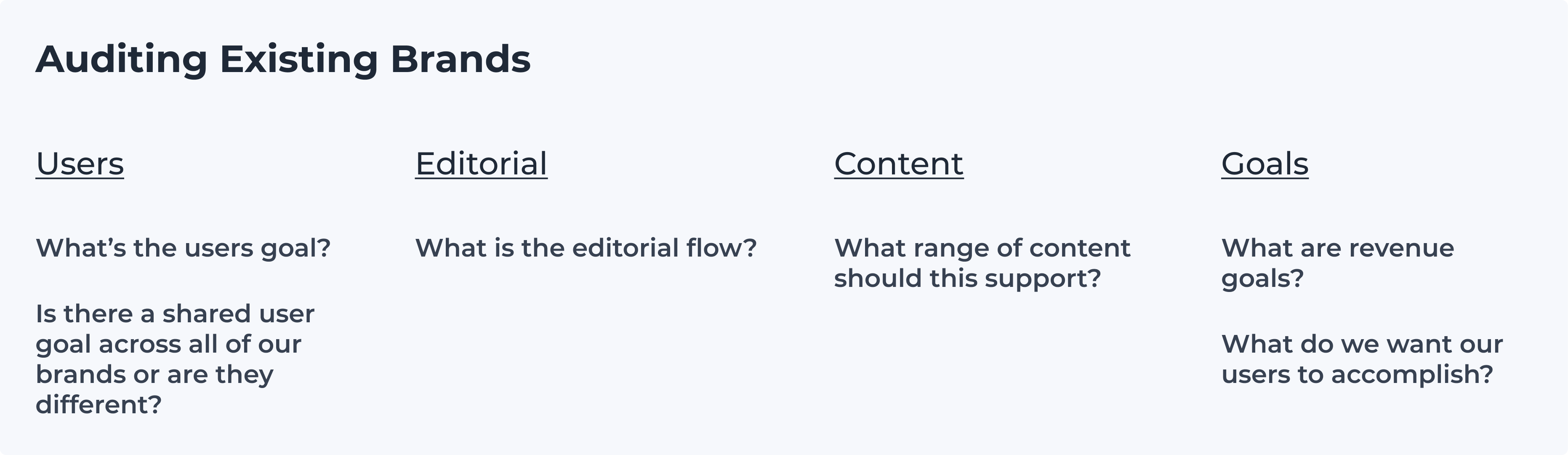
The Big Audit
As soon as the tech stack was aligned, the work for Designers can start.
One of the goals of a Design System is to bring order by removing inconsistencies, so before creating anything, a good practice is to make a complete inventory of what already exists, what is missing, what is consistent, and what is not.
According to A Pattern Language (yes, I’m going to reference it again, I love this book!)
Each pattern describes a problem which occurs over and over again in our environment, and then describes the core of the solution to that problem, in such a way that you can use this solution a million times over, without ever doing it the same way twice.
- Christopher W. Alexander, A Pattern Language
Patterns range in scale, adapting their solutions to local circumstances and synthesizing those into larger designs ensures that all forces are balanced in a way that facilitates the emergence of QUAN (quality without a name).
Our audit should include more than individual components - buttons, cards, tables, etc because it’s not just about the interface.
A successful audit includes content and people to understand the patterns of what we are producing, what our users are consuming, and how that all balances with revenue goals.
I started the audit by documenting the UI of the component and the possible ways the Editorial team could build a component in our custom page builder.
Questions I asked along the way:
-
Does the editorial team use this component to communicate content?
-
Is this component frequently used, or is it a one-off variant?
-
Does this component help funnel the user to a goal?
-
Does the Marketing team need to track this component for KPIs?
-
If so, what are the jsclicks events, and are they aligned correctly?
-
Are tracked events correctly routed to Salesforce, Mixpanel, and Google Analytics?
I used a simple Figma file to place screenshots of every combination of modifiers, variants, and layouts our page builder would allow me to build.
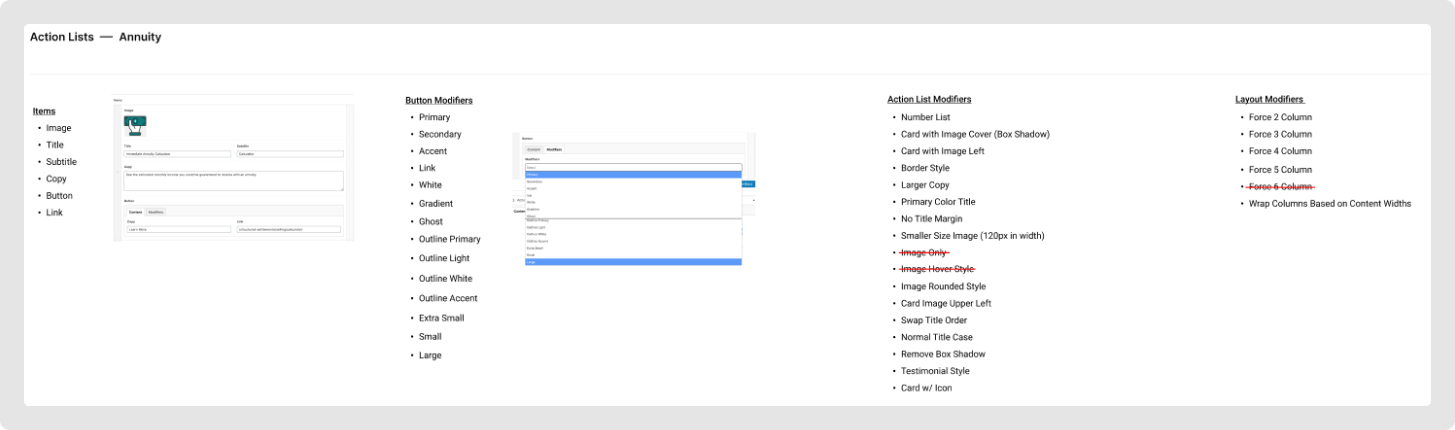
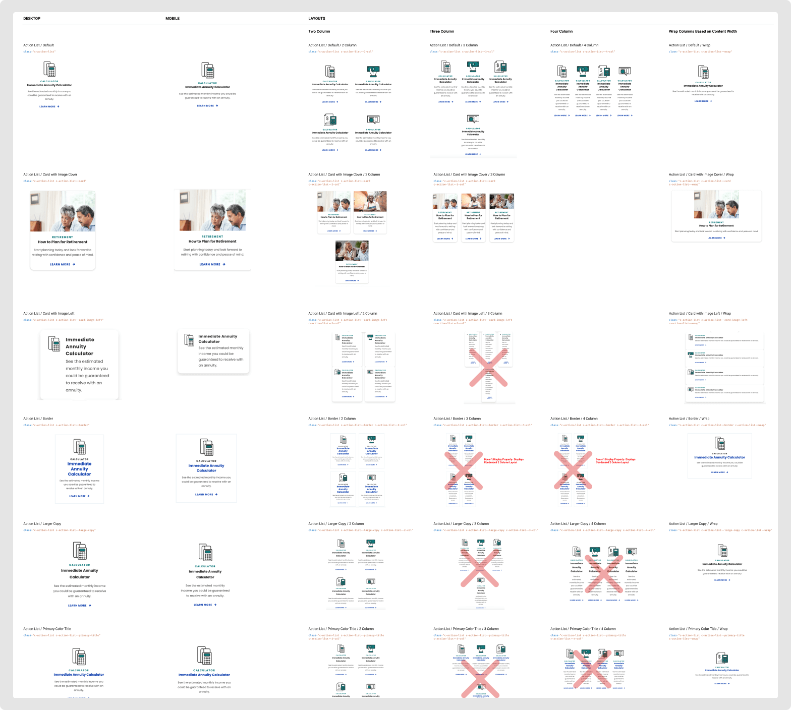
This document quickly became essential as it gave me a holistic view of what was missing or not; when you have to deal with multiple brands, you need to keep things organized.
Now that the audit is done, building the Design System work can start.
Foundations
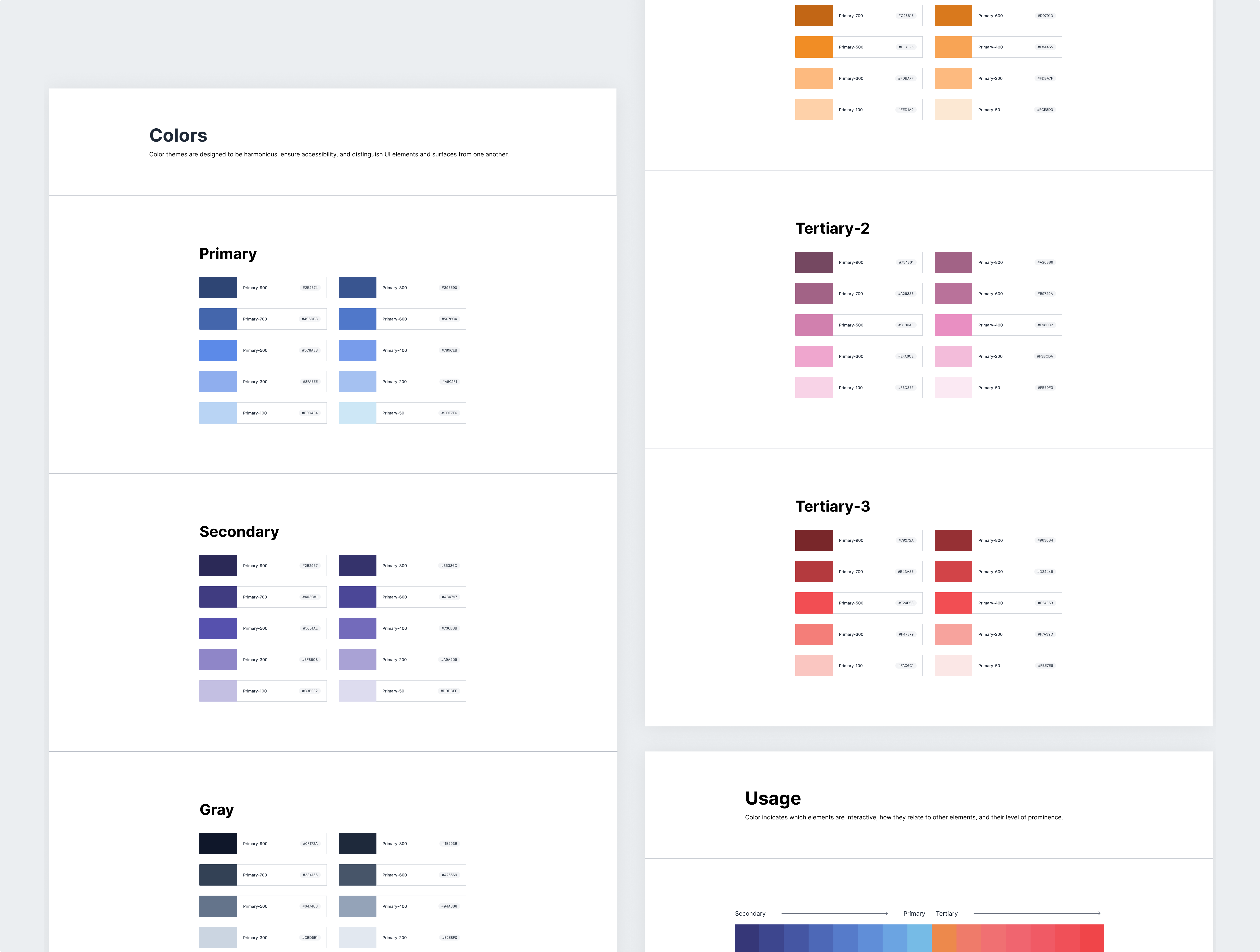
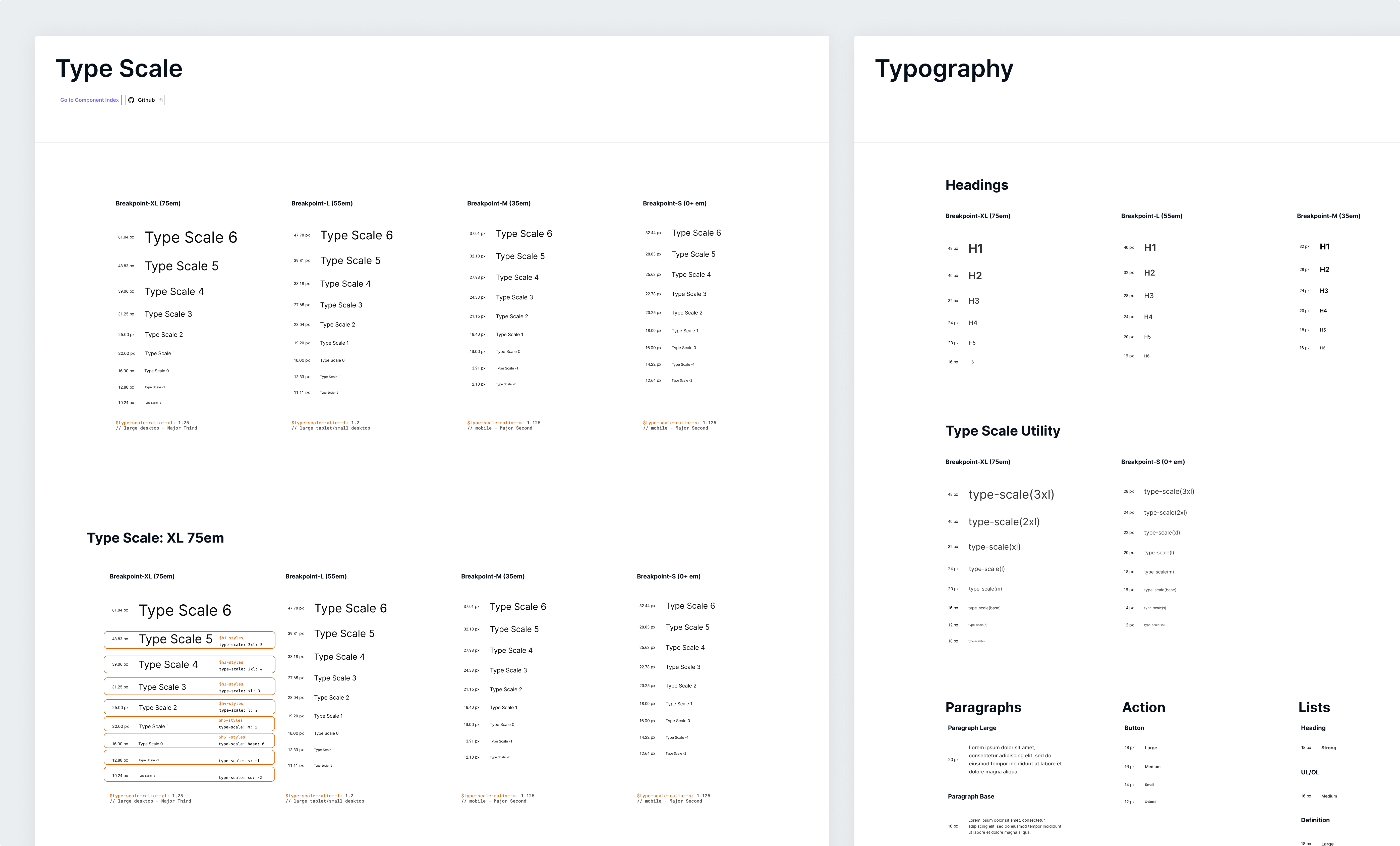
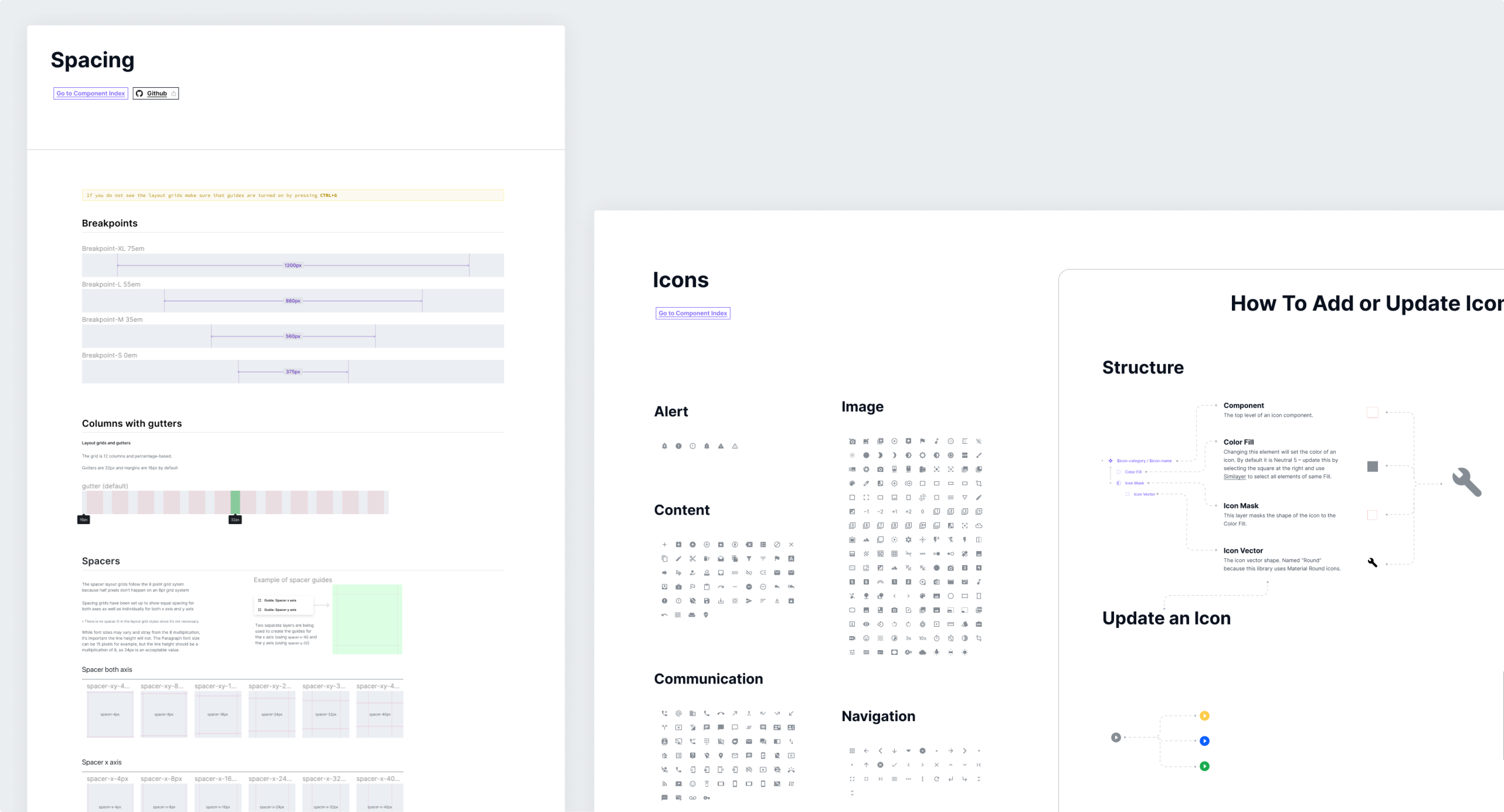
We created a foundation boilerplate that could be duplicated and themed for each brand.
Here is the foundations' boilerplate of Launch That’s Design System we call Ares:
-
Color
-
Type-scale
-
Spacing
-
System icons
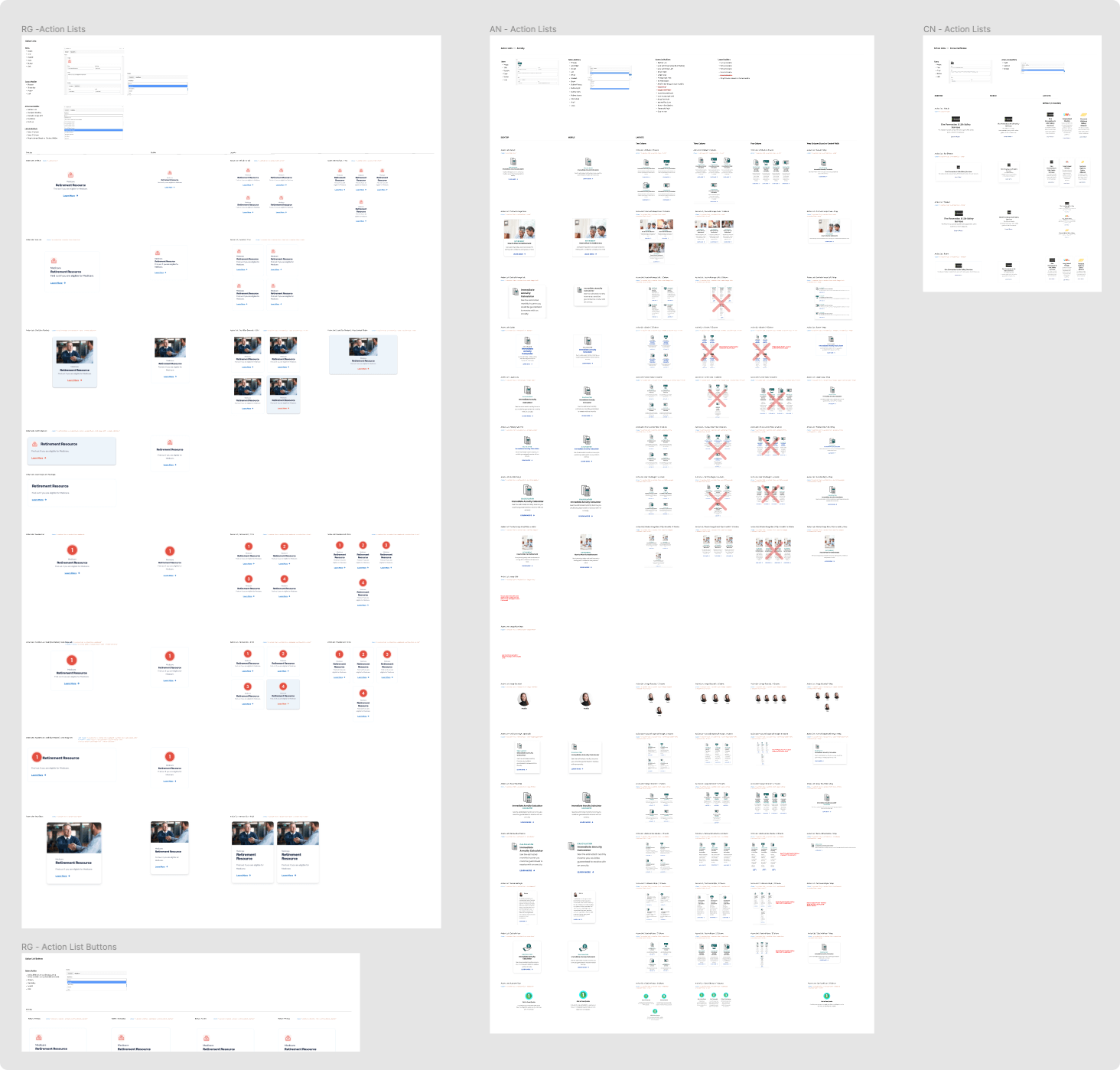
Components
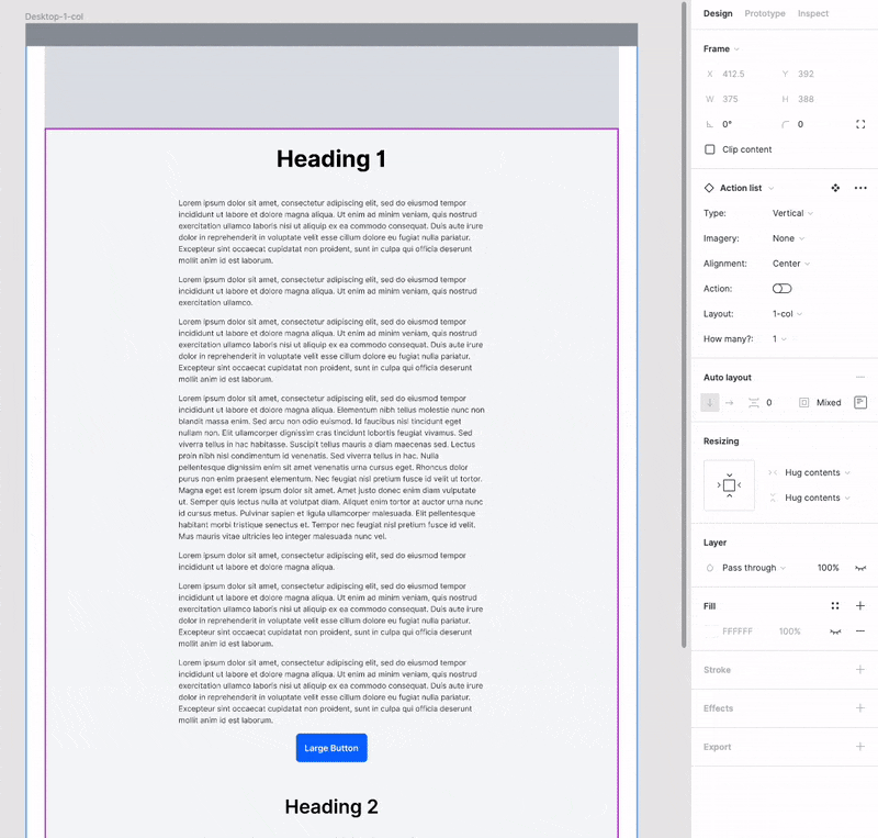
Ares is the parent Design System that contains the main components. Each main component is a wireframe crafted with its non-negotiable atoms and molecules along with its responsive mobile counterpart. Also, I built it with Figma’s auto layout feature.
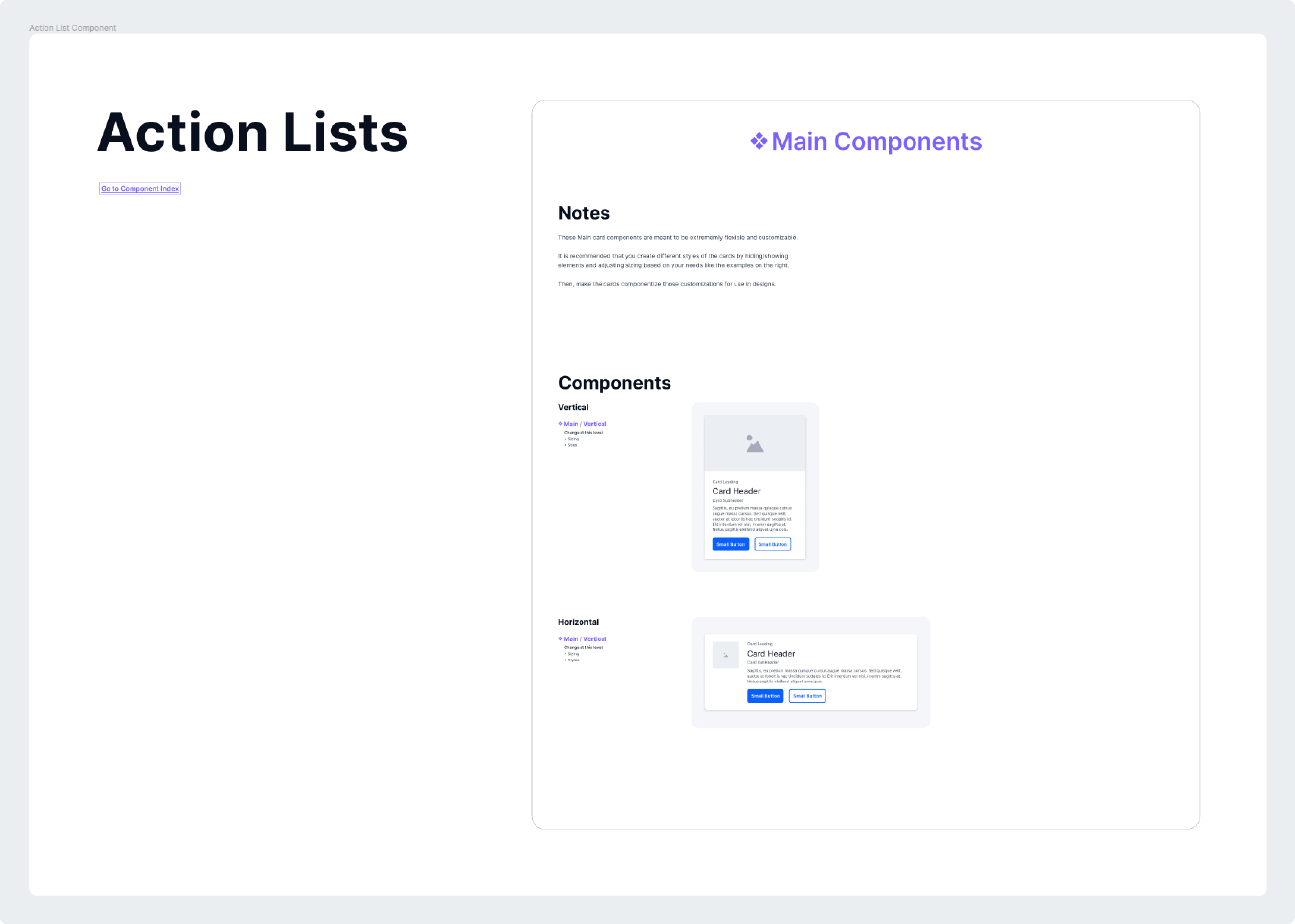
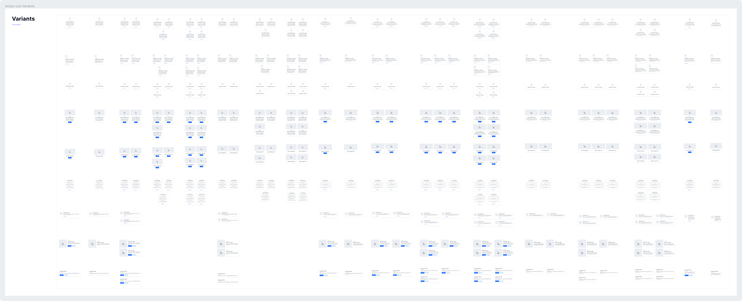
Finally, I shared the Ares library, where it can be extended by all designers for the brands they work on.
Templates
With a complete set of components ready to be consumed, the next step is to build the templates and test that everything works flawlessly.
Building templates from scratch can be very long and tedious, but the beauty of using a Design System is that you don’t need to recreate anything; all the components are already built. The power of auto-layout + variations allows the components to snap perfectly inside the template container: no more nudging or adjusting space. Designers can now spend more time testing & irritating layouts quickly.
Documentation
A design system needs to be open and accessible to everyone, so having a platform where each member of the company can read the guidelines and consume the system’s content is highly important.
I decided the best starting place for documentation would be in Figma since everyone at the organization has read access. In time, I would love to see our code documented alongside the components. When we get closer to that reality, I plan on moving our documentation from Figma to a more robust documentation platform like Zero Height.
Outcomes
The Ares Design System will always be a work in progress. Since our time with Brad Frost in 2018, we have added 3 more brands to our portfolio, ConsumerNotice.org, MesotheliomaPrognosis.com, and RetireGuide.com.
We indeed had our moments of frustration with rebuilding and launching new brands with Ares. But with each time, we got better 💪🏽
RetireGuide.com was our latest launch. It took us 3 months to build RetireGuide’s content, marketing strategy, design, and development from scratch. That process would have usually taken 6 months. Our design system decreased our time to launch by 50%.
I’m passionate about design systems and could talk about multiple brand design systems for days. If you are interested and would like to know more about my work on Ares, do not hesitate to contact me.