Redesign Annuity.org's Navigation
Entering 2021, Annuity.org wanted to move toward a more cohesive brand message. Things weren’t in disarray—we had a reliable brand, voice, visuals, and product. But years of different design and marketing campaigns led our content and marketing team unclear on how to move forward for housing and pushing out new content. Into that void, I convinced the organization to re-evaluate how it saw its own product, and how it could be marketed.
The original task was straightforward: make the site navigation scalable for new content. I was the most analytical designer on the team, which led to me leaning heavily on my institutional knowledge of data and conducting additional research to understand how our content could help users accomplish their goals. It became clear that a mere reshuffle wasn’t going to cut it. We had to investigate deeper and understand how navigation affects our ability to tell our story.
Problem
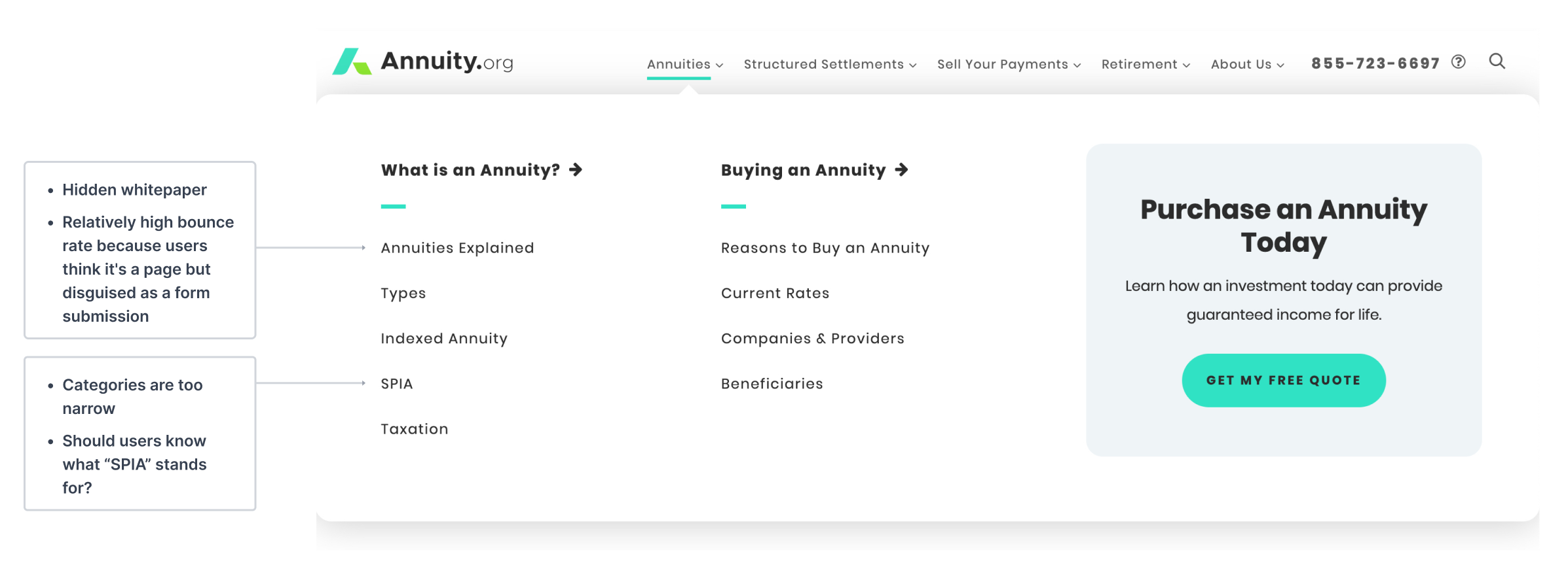
The old navigation left content unknown and challenging to discover. In past analytical reports, I noticed users bounced between unrelated pages, which ultimately led to the user to leave because they couldn’t find a solution to their problem. From quantitative data, I believed users found our experience to be frustrating and counter-intuitive. In the short term, we wanted to solve for the original task at hand. We explored scalability, mapping of what we had, but I kept in mind the issues our users currently have.
Problem 2: Buy-In
Our organization is a cross-functional team, from content writers to marketing and partners. What started as a series of meetings to get scalability buy-in, became a discussion about who, what, why, and “SEO is essential, you can’t touch it!”. At our organization, SEO is king, and it dominates every strategic initiative.
For our more prominent sites, this is the only way you can link to all the crucial pages without overwhelming a user with choices. If we go this direction, you introduce the risk of hiding all of these critical, descriptive, site-wide links from search engines.
- The Marketing Team
From my interpretation, we were hiding all these critical, descriptive, site-wide links from the user. Everyone had their idea of how the navigation should work from an SEO perspective. I explained distinctive marketing strategies over time had left the overall feel of the site navigation more disjointed than we’d like. I defended my case with various journey reports of users randomly landing on one unrelated topic to the next, which could be a reason why our bounce rate is high, which is another initiative we want to reduce. If we continue shoehorned orphaned content according to SEO efforts into the new navigation, we will run into the same scalability problem we were asked to resolve in the not-too-distant future.
The team saw how structured navigation could have a positive impact on other SEO initiatives. Working with marketing, we shifted the SEO strategy to be less reliant on the top navigation. They grant me the autonomy to design how I see fit. As a peace offering to the marketing team, I offered to test and validate the shift of SEO efforts and its effect on search engine ranking.
Prototypes
Let’s Marie Kondo Dis
The old navigation imitated the way our teams built rather than the way users experienced the product. Our topics were sometimes too broad and sometimes too narrow, so streamlining those, relative to the content we had, was a complexity as well. The site itself had several stylistic updates, so I molded something that felt like it lived in the same world. I found a balanced design to distinguish between umbrella content versus focused.
How can I tell the story of our user’s journey? From building a mental model of what Annuity.org is, to understanding how it can help their use case.
- My little designer brain
Contextual Items
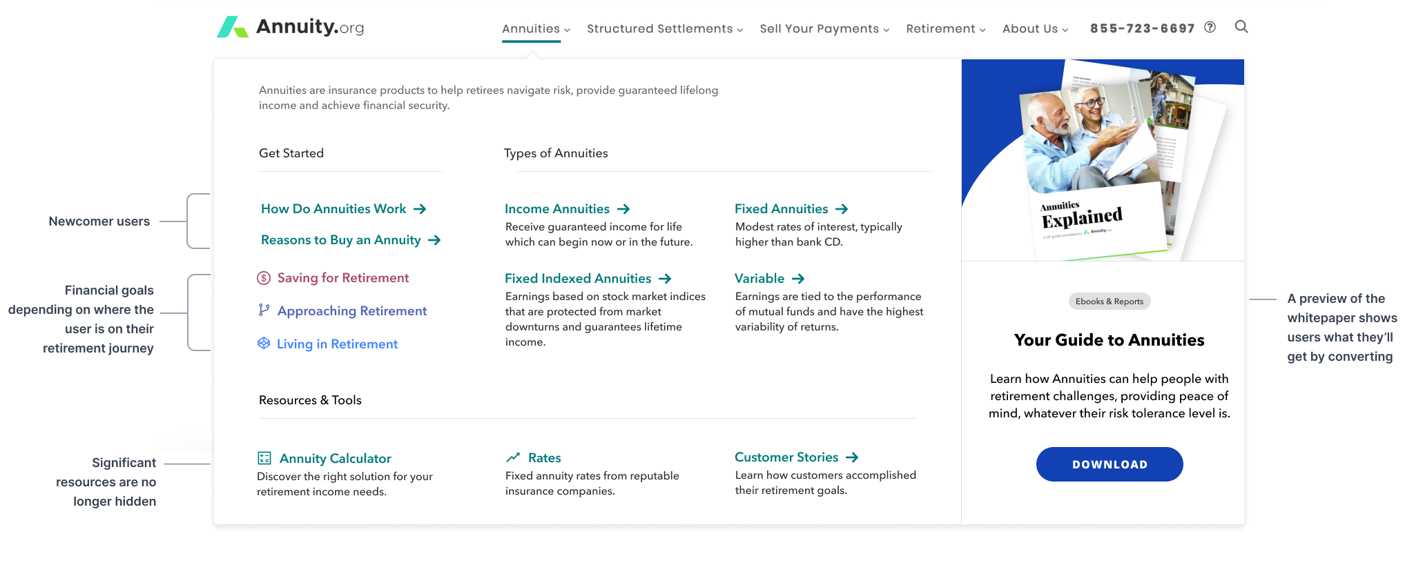
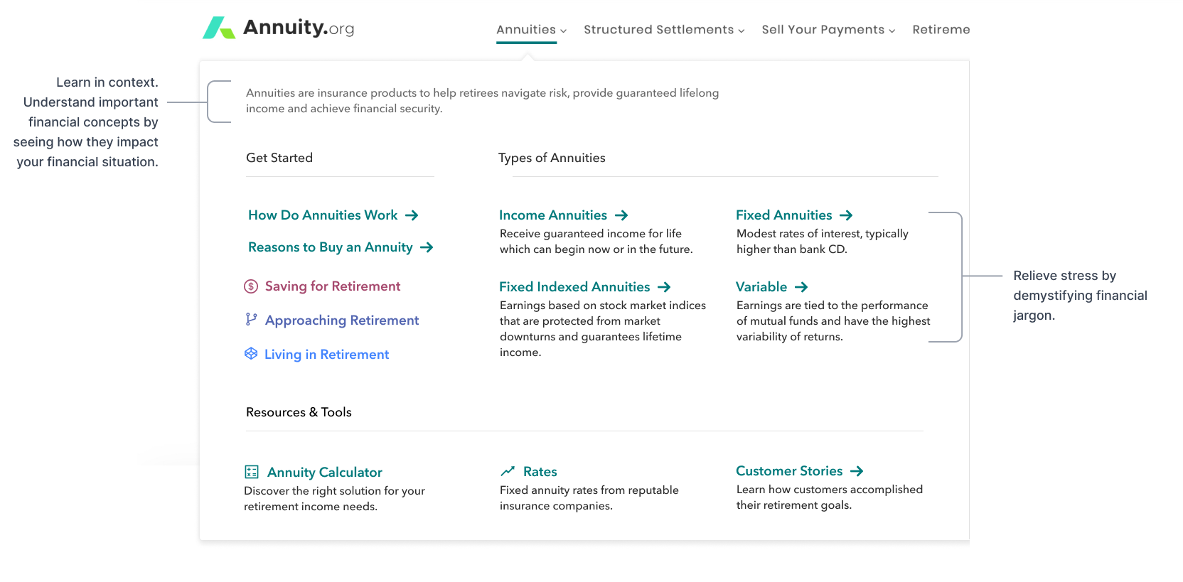
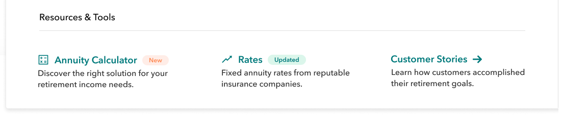
I thought if I provide narrative subtitles of each item, the layout would be more intuitive for the user’s understanding, resulting in higher engagement across the board. I also explored many badges and tooltips to show the site is updated frequently.
The Hub
I presented my first iterations to the team, emphasizing that there was a great deal of content that didn’t fit under our existing topics. The sheer range of content on the site presented our biggest challenge.
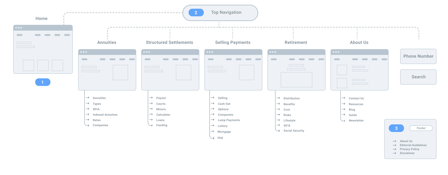
We set up more meetings with team leads across the organization to talk them through what we wanted to do and how they could support. It lead to brainstorming sessions with marketing, content, development, and design to build from my mockups. A new site map emerged with “hub pages”.
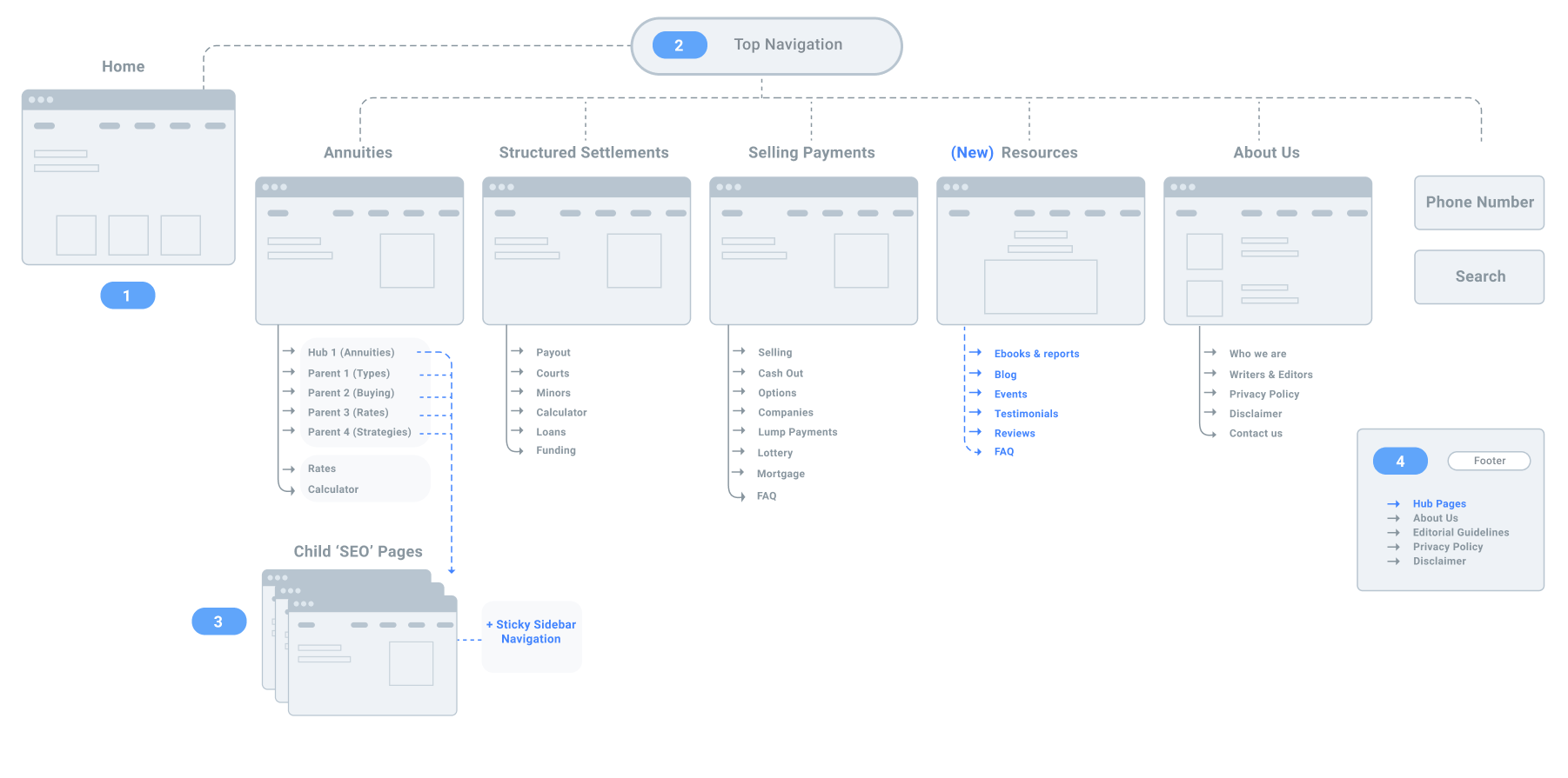
They connected on my idea of telling a story through the navigation. Specifically, they liked how narrative subtitles could provide a mental model of what you can do with Annuity.org. This is how “hub pages” emerged. It is a page that clusters key goals into collections that support the preliminary positioning. To manage the problem of scalability, we nested “SEO” template pages inside a hub page with a sticky sidebar nav. That allowed us the elasticity to fit more content easily, as well as enable users to dive deep on the topics they’re interested in without being shepherded to pages they do not care about.
SEO Templates + Sticky Sidebar Nav = ❤️
The first hub consists of the main sub-topics in Annuity.org; these are “Parent Pages”. These pages are curated, yet very flexible. The “SEO” pages, on the other hand, are templated with abundant text. A child SEO page will inherit the graphic content and headlines as its hero from the content section of a parent page. These pages are meant to be found through exploring the site, paid advertisement, or organic search. On parent and child SEO pages, we are testing the idea of adding a sticky sidebar nav as the user scrolls to focus and limit random page movement.
Testing
Before going all-in on the redesign, the team wanted to test the first hub (Annuities) to see if it delivered the results we were looking for. The number one goal of this design was to achieve new levels of elasticity going forward. Annuity.org is an ever-changing product, so a site navigation structure that works for today’s iteration is not certainly going to work for tomorrow’s. I designed with that in mind so that we would have room to have general categories where we could host more content now and going forward. I’m excited about how each topic is modular, allowing for not just main items of content, but the ability to insert financial tools, case studies, and customer testimonials as the team sees fit.
Outcomes
The team detected higher engagement with all navigation links. Users viewed SEO child pages to a much higher activity through the sticky sidebar nav. Although I removed the old CTA from the nav, leads increased drastically. The old CTA repeatedly generated flat results, which goes to show that best practices mean nothing if they aren’t validated within a specific context.
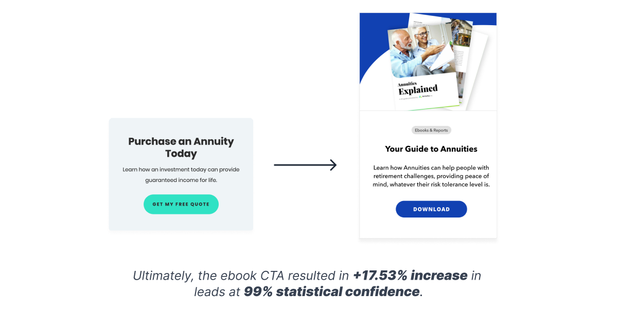
Ultimately, the ebook CTA resulted in +17.53% increase in leads at 99% statistical confidence. This indicates that Annuity.org users may need more education around the topic itself before they are willing to inquire about a quote. Based on these results, future experiments should focus on either educating users about financial products or make it more straightforward for users to access this type of content.
Conclusion
In early 2021, Annuity.org’s marketing site navigation was a bit of a makeshift. With the help of a very collaborative team, we found an argument for a scalable centralized system. This was met with excitement (and drama), bringing a wave of change to the organization on how it thought about its product. On this initiative, I was able to see firsthand how designing with research, autonomy, responsibility, and impactful solutions in mind will position others to champion your ideas. I advocated testing team members' ideas to bring people to the cause. This helped widen the scope of what design can offer to an organization, which proved to have a significant effect on collaboration for the better. I am fortunate to have played an essential role in how Annuity.org structures itself for the future.
The current initiative is still in testing and development.